Showing posts with label paint. Show all posts

Wednesday, August 12, 2015

Floored!

So when I bought my home, I was in love with everything. Not necessarily every detail and color, but with the incredible possibilities that I could instantly imagine! When I saw the floor of the third bedroom, which I fondly described as two shades of baby poo, I knew that it wasn't perfect, but that I could change that fact. But being crazy busy with teaching and learning, I saved this task for a summer DIY project!


If you know me, I sometimes (a lot) have impulsive ideas that require me to actually slow down and process them so that I don't make a bad or regrettable decision! I usually bounce such ridiculousness off my BFF Ali because I know she will either give me an honest response or jump on board the crazy train with me! Haha! So I bounced the CrAzY idea of painting my floor a neat color, specifically aqua, not just plain white like I always assumed I would. Ali sent me a super photo from a blog she follows on instagram. After seeing the picture, I knew for sure that I wanted to follow my idea and dive in with the project! Thanks for helping push that crazy idea Ali! 

For more awesomely awesome ideas, check out Beneath My Heart!
Of course I turned to my handy-dandy Pratt & Lambert paint fan, and compared colors to the image that Ali had sent. Although my color didn't match perfectly, I was excited when I encountered Cilantro 22-2 in the fan. 


My next move was to go straight to City Lumber, my locally owned and operated hardware store to talk to Dan the Paint Man. If you have a paint related question, he's sort of an expert. Thanks to Dan, I was able to avoid that massive project of sanding my floors, or having to use oil based paint which is stinky and takes longer than my impatient self likes to wait. Dan recommended that post cleaning, I prime the floor with Cover Stain, an oil-based primer that covers stains, oil or latex paint, and prevents stains from coming through. It's like a super strength version of Kilz Primer. 


I cut in around the edges and the door trim, then rolled the rest of the floor using a broom handle attached to the roller frame. The floor then dried overnight and throughout the following day. If your floor color is really dark to begin with, Cover Stain dries to second coat readiness in about 30 minutes so you don't have to wait a day. However, although my floor was an ugly color, the one coat of primer was sufficient. I then moved on to the actual floor color, the CILANTRO! 

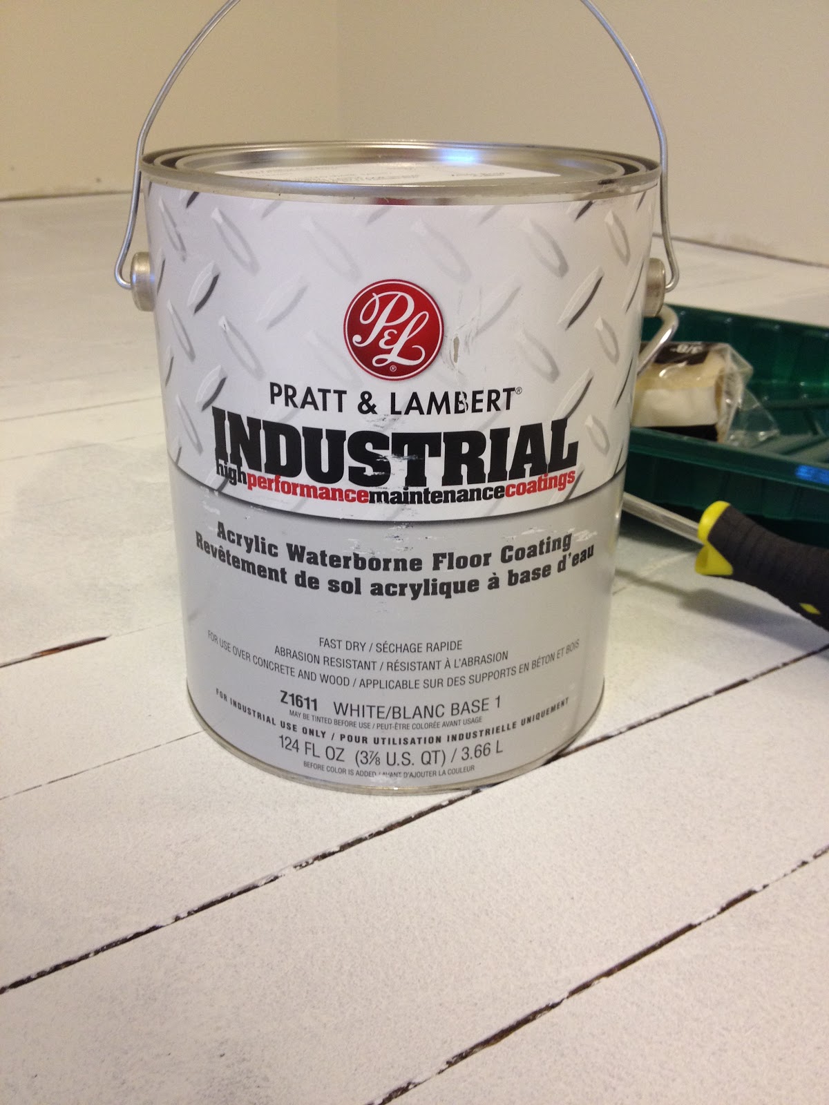
Using Pratt & Lambert's Industrial Porch and Floor Paint. As I said before, I wasn't excited to use an oil-based paint, and Dan was able to offer this product in acrylic so it was more use friendly when it comes to smell, clean up, and dry time.


Again, I cut in and then rolled a total of two coats. Although not necessary, my first coat dried overnight and through most of the next day because I didn't start the first coat until 9:30 the night previous and had to work the next morning. I have to say that the final color on the floor turned out better than I anticipated and made me literally squeal with joy! 


The next step was to tackle the problem of the missing baseboards in the room, because there was about a 3/4" gap between the floor and the sheet rock of the wall. This is when I enlisted the help of my ever knowledgeable and helpful father. Although I have a large quantity of stray molding lengths in various storage areas of the house, there were not enough feet of one style to complete the entire room so instead I opted for simple one by four pine boards. This also was based on the fact that the neighboring bedroom had simple baseboards and I wanted to maintain some continuity. Like the floor, I used Cover Stain to prep the boards and then had interior latex in a satin, matched to the existing trim color throughout the house. 

My makeshift painting station on the basement floor. Ps: Keep that background table in your brain for later!
Once I had two coats of Cover Stain on, to help prevent any potential sap seepage, I did a coat of trim paint. My dad then kindly gave up part of his day to help remeasure the room lengths, cut the boards, and attach them to the wall. He did so using a pneumatic nail gun. The holes left were small and easily filled Spackle so that the boards could be touched up quickly with paint.

The final result is pretty wonderful, and I smile every time I walk into the room now! The floor goes perfectly with the yellow table that I snagged, after eyeing for months as a potential craft table, from Vintage Hardware! (GO FIGURE!!!) Now I need to finish moving the rest of the storage back into the room, get organized, and get crafting! Stay tuned for another craft room related project in the form of some furniture rehabilitation and TLC.


PS: Here's a typical Melissa side story for you! With summers off from teaching, I snagged a fun job working at Frite & Scoop (Follow them on Instagram and Facebook too!) Well as an ice cream lover. obsessor, and junky, I have to say that their Bubblegum flavor is by far one of my most favorite flavors. So one evening, after having finished all of the coats of paint on my happy floor, I sat down to a tasty treat of ice cream. While sitting on my couch, probably watching the latest episode of Rizzoli and Isles, I pulled the lid off of the pint container to dig into the bubblegum flavored deliciousness. As I looked down, I had a deja-vu moment and realized with great pleasure that I may have subconsciously made my love of F&S Bubblegum ice cream a permanent declaration in my house! Whoops! What's that hashtag? #sorrynotsorry! Cheers! 
That one time that I discovered that I love @friteandscoop so much, I accidentally painted my floor to match my favorite bubble gum ice cream... Not sorry. #friteandscoop #paintandicecream


Monday, August 3, 2015

From Inspiration to Reality!

My actual inspiration page, from which I then actually purchased my wants and wishes!

When I first began considering how I wanted my main living area to look, I started by collecting pictures of things that I was drawn to stylistically. As I collected, I came across a rug from IKEA that became the anchor for my design inspiration.
Alvine Ruta rug, measures 5'7" by 7'10"  
Based on this decision, I was then able to focus my planning and inspiration board to fit around my anchor piece. For me, I selected paint colors next because I feel as though that is the actual first step in designing a room, getting color on the walls. The colors I was left with originally were cream, dried blood red, and a pretty but not coordinating aqua.

Living room - Before
Dining room - Before
I selected a yellow that was not the same shade as the mustard in the rug, but instead a light buttery color. And I paired it with a navy in the dining room, which I pulled from the edge of the rug. My personal paint preference is Pratt & Lambert interior latex in an eggshell. I used Eggnog (10-30) and Captivating (24-14) as my wall colors to replace the mismatched combos above...

Pardon the blue tape everywhere, that doesn't exist anymore! 
I then collected the items from my inspiration page, and other items that matched the board. The pillows from the inspiration page were purchased at Target, and the chair was picked up at IKEA.

And in searching for the link for this post, I just discovered that they make the chair in YELLOW now!!! Oh man! I have the urge to own a contrasting set... Good thing the chair doesn't fit in my little Honda, or I'd be on my way to IKEA right now! 

My favorite pillow of delightful feathers was also from Target. 
The couch was custom made by the Best Slipcover Company. Their products can be ordered through Vintage Hardware! I selected a classic shape from the Cindy line and then selected the fabric that I wanted to pull out the gray border on the IKEA rug. The couch was definitely my investment piece, being constructed from solid wood and the cushions are down stuffed. It is made in the U.S.A and can either be slip covered or fully upholstered. I opted for the slip cover so that I can easily wash it if necessary and can potentially change up the cover down the road if I feel like it without having to buy an entirely new couch. Talk with Becky at Vintage Hardware to check out all of the couch, love-seat, chair, and other furniture options.


The yellow throw pillows are inexpensive options from Target's Room Essentials line. And the navy chevron pillows (one not pictured) are Target purchases as well! And so is that snazzy lamp! The lamp was purchased about 3 years prior to ever looking for a house to buy and was meant to be! Although Target sells this base as a set now, they also have a more budget friendly, different lovely yellow lamp

The remaining large furniture items including an upright piano, large bookshelf, coffee table, side table, and other miscellaneous things were acquired in my favorite way. From garage sales, inherited, or purchased from local salvage businesses. My style is definitely vintage inspired, with rough edges, but balanced with warm, cheery tones and a variety of textures. 


I've owned this map since high school and finally put it to perfect use! It's a great pop of fun colors!
The concept of creating an inspiration board can seem like a waste of time or overwhelming, but I think it helped keep me organized. Plus, it was definitely not as overwhelming as I think creating a room would be if there was no direction or guide. Obviously everyone tackles projects differently, but I'd recommend creating an inspiration board based on an anchor item. And don't think that anchors have to actually be large items. It could be a pillow, artwork, a rug, a piece of furniture, or even something small like a special memento item. Decide what is important and work from there, selecting coordinating colors, and a variety of textures. My BFF Ali told me during this process that a good room should have at least six different textures, and I am confident that I have well over that number! And I've received Ali's approval on my house so it must be properly textured... :) Love you Ali! I used fabrics, wood, metal, and ceramic to create a large variety of texture. Some are soft, some are hard, some are smooth, some are rough, but all create a cohesive space. And feel free to mix patterns! I used chevrons, stripes, geometric prints, and solids. Oh, and one feather embroidered pillow! 

Mostly, I think the most valuable advice I can give in regards to creating a living space that you love, it means you have to select things you love to be in that space. If you don't LOVE LOVE LOVE it, don't bother. Mediocre is only going to bother you in the end which means spending more time and money to get something you actually want. And if you really LOVE LOVE LOVE it, then sometimes that means you spend some decent money. Shopping at Target and IKEA helped save some money, as did garage sales or fleas, but sometimes perfection is ponying up the cash for a long-lasting, quality piece that you will love for years to come. Prioritize what items you plan on investing in. For me it was the couch. And if you could sit on or nap on my couch, you'd understand why I went big on it. Seriously, it's that awesomely comfortable. If you have to live someplace, then you should love everything you can about it. Especially if it is someplace that you've committed 30 years to!

Cheers! And happy decorating!


Monday, December 30, 2013

Shutter Project!

Some time in early November I posted an Instagram picture of this super cute shutter that I snagged for a song at Vintage Hardware (WHERE ELSE?!) There were more, and I was SO tempted to get another, but was good and stuck with one! My aunt Kathy and I were talking about just how adorable the shutters were, and how they were just perfect for a neat project. How on EARTH could I say NO?!

Here is the original shutter. Chipped paint, dirt and all!

Wiped the dirt and grime off and went to town on that chipped paint! I used a palm sander to eliminate quite a bit of paint, then used a 5-in-1 tool to scrape even more paint from the shutter. And then it was MoRe sanding! Then more cleaning to get rid of all the dust!


I then used cream colored paint, the same leftover paint that the candlesticks received! I debated on a second coat and opted against it at that time.  It was still a bit rough looking and imperfect, as you can see below. But as projects go, I changed my mind at the end.  


I then used cardboard letters as stencils. To go with the Christmas tree design at the top of the shutter, I opted for a holiday classic, NOEL. To do this, I measured from the top and bottom for my first and second letters. Then split the difference for the middle letters. Each letter ended up being 1 inch apart from the other! I didn't have an N for tracing so I had to fudge a little with help from an H and a straight edge. 


The final tracing result! I know they are a bit light, but that is okay since I need to paint over them!


I used a RED Sharpie paint pen in order to give it a holiday feel. Once the paint had dried, I took a high numbered grit sand paper and roughed the letters up just slightly. I wanted them to have a bit of wear-and-tear to match the rest of the shutter. 

In the end, once the letters were painted, I used a bit more cream paint to touch up around the letters and give a second coat to the really rough patches.  One thing that I am still debating, and can continue to debate,  is whether or not I want to outline the tree with dark green paint. Hmmm!!! Decisions, decisions!

What are your thoughts? Should I outline the tree? Or leave it? Readers, HELP!


From Rags to Riches. Or Spindles to Candlesticks?

Just another DIY project with materials from one of the best LOCAL stores in town! VINTAGE HARDWARE, OF COURSE! Snagged these great spindles for a decent price! 

The project as a whole only cost me about $15! The sandpaper is already EVERYWHERE in the woodshop, and the paint was leftover from my bookcase painting endeavor at school this summer. 

Cut the top and bottom off each piece so they were smooth and flat, sanded each spindle until they were smooth! 
Had to ask for a bit of help from my handy tool man father. I was too afraid that I would absolutely destroy the spindles if I tried to drill the candle holder holes! I'm semi-skilled with power tools, but I know when to get help in order to maintain project perfection! Thanks PA!
Look at that beautiful cream colored paint! Lots of left over for the spindles. (And for the shutter! Stay tuned for that!) I used two coats of paint for each spindle for the best coverage. 
This one is technically upside down! Whoops! But the finished product looks pretty great. At least I think so!
These lovely spindles were a gift for my even lovelier sister-in-law! Their final resting place is in the Midwest. Rachel will have to send me a final product photo once they find an official home! 

Friday, November 22, 2013

Fun and Funky Folk Art!

I have to preface this with the fact that I have absolutely terrific projects going in the shop write now. The only problem is that they are all Christmas presents and I can't blog about them lest I spoil the holiday surprises! This is a lesson in patience for a very impatient person! 

Fortunately my students have been working on a fun art project the past couple weeks and a handful of them are complete for the world to see! 

I found this clever plan on Pinterest (of course) and couldn't wait to give it a shot! I have to say that for a person who is able to craft and create on my own, but not share and teach such things very well, Pinterest is a teacher's lifesaver! I have become a fan of an art project blog, Painted Paper, that is chalk-full of kid friendly projects. 

Material list:
8.5" by 11" white paper
Pencils
Black Sharpies
Crayons
Water color paints
Black construction paper

To start the project, we looked at the inspiring folk artist, Heather Galler (check out her Etsy shop). I then gave students the basic steps aloud, written on the board, and showed them my example pieces. Students needed to use about 2/3 of the paper to create an outline of the landscape, including any hills or curves. They then divided the land space into at least fifteen areas.  Once they had the land divided up, they added patterns including stars, hearts, stripes, checkerboards, flowers, zigzag lines, and many more creative designs.  The final piece of pencil work was to create a barn or house, one or more trees, and a festive, funky sunshine.  All of the pencil lines were then carefully traced with black Sharpie marker so they would stand out in the end.

The students then used crayon to color in the patterns, leaving the background of each area white.  If they had stripes or checkerboard patterns, many kids colored every other section so they could add color through paint to the remaining sections.  

Once the crayon work was complete, they carefully painted in the all of the white paper that was left. This gave the art pieces great dimension and texture. Once the paint was dry, art was mounted on black construction paper, and boy did the colors pop! The final products that I have received thus far are AMAZING! Absolutely phenomenal! I may be biased, but seriously... Check them out! 


Tuesday, December 11, 2012

'Tis the Season (Part Three)

As if I didn't have enough projects on my plate, I suggested making a pallet sign for church! Silly me! Though it was challenging, it was still a fun and rewarding project.  My Uncle Larry was so kind to collect and deliver a couple pallets from which to take slats, and my dad was nice enough to dismantle them for me while I was doing other projects! (I wouldn't get a thing done if it wasn't for the people in my life.) Once they were separated, my Aunt Kathy and I selected the best boards to use and got them sanded down, to make them both smoother and cleaner in color. We used a lower grit because our goal was not too have paper soft wood, but rather get rid of larger marks and damage to the wood. 


We then arranged them in the order that we wanted, and my dad attached the support beams.  The beams are not too thick, only about a half inch, but they are long so they can secure all of the slats. 


He attached the beams to the back of the sign with screws so the bracketing would be invisible. The holes that are visible below are from the pallet nails, but I think they add character. 


Once assembly was taken care of, I mixed a forest green craft paint with a large quantity of water.  This mixture became the base wash for the sign.  I got a bit nervous once it was all washed because while it was wet it seemed to have a mossy, mildew look. Fortunately it dried much nicer, or else it would have been back to the sander!


My paint was named "Evergreen" which was most appropriate considering our country Christmas theme called for traditional Christmas greens!


At this point, I laid out the text in the format in which it would go on the sign.  I used to generic fonts that come pre-installed on Microsoft Word, Bodoni MT and Monotype Corsiva. The font size varied depending on the text, but I chose to emphasize key words with size and make lesser words a bit smaller.  This can be totally up to your own discretion and relies heavily on the space and board width available. 


Because I am quite possibly crazy, and probably because I had limited resources, I hand traced all of the words onto the wood pallets.  This involved me outlining the words while the paper was still in place, but pressing hard enough that the pencil made a dent in the wood below.  Then I carefully and lightly outlined those indentations using the pencil for a more visible line within which to paint.  When everything was indented and traced, I took my white Sharpie Medium Point Paint Pens and began outlining! The paint required three to four coats because the wood was so dry, the first coat basically just absorbed. The picture below shows words at various levels of painting.  The words at the bottom had received three coats, the center lines had two coats and the top, faint areas only had the first coat.  


I did choose to free hand the Bible reference at the bottom, for two reasons, I forgot to print the reference with the rest of the verse, and I was running out of patience for tracing! I decided that my daily cursive lessons for my students needed to come in handy in the real world! 


The sign was hung (more generous and mostly patient help from my dad!) in the sanctuary above the main doors for all to see! He used two anchors and two 3 inch screws to attach it to the wall.  He was actually able to attach through one of the gaps between the boards so it did not require a hanger or wire on the back. Fortunately the screw were a good color to blend in with the green tint! 
I am so proud of how well it turned out, especially because I was a bit nervous that it would be too rough in appearance to be hung in a church.  I received a few compliments even from people who then asked if they could bring me pallets to make them a sign! Um... first I need to finish the mini sign for myself! 

That mini sign and my Christmas present wrapping paper theme are next on the docket for the Christmas series so stay tuned! And happy crafting!

Wednesday, June 13, 2012

The Willow Pattern Story!

I saw this art project on Pinterest months ago and have been wanting to have my students participate! I ordered "The Willow Pattern Story" by Allan Drummond from Amazon so I could have a text based introduction for the project.  I try to relate all of my projects to either something we are studying or to a book that I can share with the kids to give them a bit of background.  The project was fairly inexpensive, I bought about 8 packs of variety size paintbrushes from our local dollar store, Deals Only. The plates were about $3.00 for a pack of 100! You need paper plates, not waxed covered, if you want the paint to stay! The paint came from our school supply closet, blue and white tempera.  Students were given their Willow plate and a second plate for mixing the paint for varying shades of blue. Each group also had a couple cups of rinse water and sets of the paint.  In hind sight, I should have used wax covered or plastic bowls for the paint rather than more plates, because they would be more liquid proof and would be easier to cover with saran wrap. Oh well, to remember for the future! When students completed their pieces I hung them on the bulletin board for all to see!


While they painted, I displayed a tea saucer that I borrowed from my mom featuring the Blue Willow pattern.  This helped give students a visual reference for what they heard about in the story. 


The students worked hard to imitate the original pattern by incorporating the love birds at the top of the pieces, a river, pagodas, a zigzag fence, the bridge with three people crossing, and various trees. 


I had a couple unfinished pieces at the time of the following picture, hence the awkward gap!